Making complex cities legible

I have lived in Los Angeles for most of my life, and I still regularly discover parts of the city that feel completely new to me. Sometimes that sense of discovery is exciting. At other times it reveals something about the way Los Angeles works: a place can be physically close and still feel inaccessible.
For a period of my life I commuted from East Los Angeles to Santa Monica. On particularly bad days the trip could take close to three hours. Experiences like that shape how we understand a city. Instead of seeing Los Angeles as a connected whole, we begin to experience it as a collection of islands.
Public transportation has the potential to connect those islands. But the existence of a transit network does not necessarily mean people understand how to use it. A system can be physically present and still feel inaccessible when its information is difficult to find, interpret, or trust.
That makes transportation more than an infrastructure problem. It is also a problem of geographic information systems, information architecture, and user experience.
This site is an attempt to work through that argument by building something. Everything you see here was generated from the transit agencies’ own published schedule data — no map was drawn by hand.
A transit network is also an information system
Consider everything a rider may need to understand before beginning a trip. Which service is available? Where is the nearest stop? Which direction should I travel? Where do I transfer? When will the next train arrive? What happens if I miss my stop?
The physical network is only one part of the experience. Riders also have to navigate a large information system composed of routes, stations, schedules, signs, maps, symbols, alerts, and applications.
This is where the three disciplines meet. GIS helps us understand where things are and how they relate to one another. Information architecture determines how that complexity should be organized, labeled, and presented. User experience asks whether a real person can understand the information and use it to accomplish something.
Data does not tell its own story
GIS gives cities powerful ways to collect, analyze, and visualize information connected to location. A city can map collisions, identify gaps in transportation coverage, examine pedestrian access, or study whether public services are equitably distributed.
But having access to data does not tell us what to do with it. We still have to decide which questions we are trying to answer, whose needs we are considering, and which information is relevant to the decision. More information does not automatically produce greater understanding.
Jorge Luis Borges explored this idea in his one-paragraph story On Exactitude in Science. He imagined an empire whose cartographers became so committed to accuracy that they produced a map at the same scale as the empire itself. The map reproduced the territory perfectly, and became practically useless.
A map is not a smaller copy of the world. It is a decision about what matters.
When accuracy gets in the way of understanding
Early maps of the London Underground preserved the physical geography of the rail system. As the network expanded, they became harder to read. Routes curved and converged, and stations in central London compressed into an unreadable knot.
Harry Beck approached the problem differently. He was an electrical draughtsman, and he treated the Underground more like a circuit diagram than a geographic map. His design straightened the routes, limited them to a few fixed angles, and spaced the stations evenly. Transport for London notes that his 1933 design was initially considered too radical. It became one of the most recognizable pieces of information design in the world.
Beck did not draw London more accurately. He drew the journey more clearly.
Geographic. Every curve is where the track runs.
Schematic. Same lines, same stations, same order.
The precise curve of a rail line is rarely the most important information for a rider. Riders need to know which line to take, in which direction, where to transfer, and where to exit. By reducing geographic accuracy, Beck increased functional clarity.
That distinction matters well beyond transit. Accuracy should not be judged only by how faithfully a design reproduces the world. It should also be judged by how well it supports the task a person is trying to complete.
How people understand space
I first encountered survey and route-based navigation strategies while studying cognitive science at UC San Diego.
A survey strategy helps someone build an overall mental model of an environment: you look at a map and try to understand how places relate to one another. A route-based strategy breaks a journey into a sequence of actions: continue forward, turn at the next street, transfer at the next station.
Turn-by-turn navigation primarily supports route-based behavior. It tells us what to do next without requiring us to understand the larger environment. A transit map occupies an interesting space between the two. It gives us a view of the whole system while also letting us trace one specific sequence of stations and transfers.
That is easier to feel than to describe, so the map below is running a real weekday timetable. Watch the whole system and you are reading it as a survey. Pick one train and follow it and you have switched to a route. Neither strategy is better; they answer different questions. Good information design does not assume everyone understands an environment the same way.
Culture can become part of the navigation system
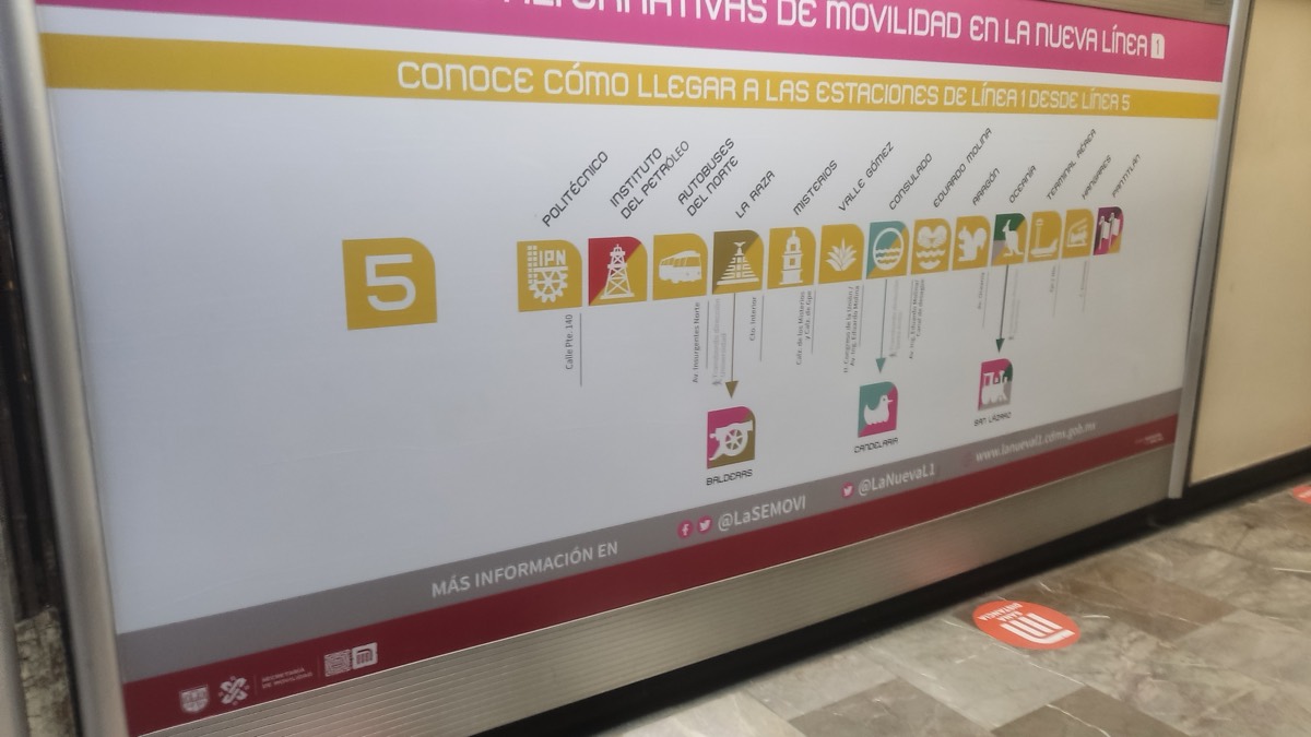
Clarity is not achieved only by removing information. Sometimes meaning makes information easier to recognize.
The Mexico City Metro is the example I keep returning to. In addition to its written name, every station has a distinctive icon tied to a place, landmark, historical reference, or local identity. Chapultepec station is represented by a grasshopper — the name comes from a Nahuatl expression usually translated as "grasshopper hill."
The symbol is not decoration. It is a second way to identify and remember the station. A local resident may recognize the historical meaning. A visitor who cannot pronounce the name can still recognize the grasshopper. The icon works across different levels of familiarity, language, and experience, and it makes the system feel connected to the city it serves.
It is worth being precise about why that system exists. When the Metro opened in 1969, roughly a third of the population could not read. Lance Wyman and his collaborators designed the icons so the network could be used without reading it at all. The cultural richness is real, but the icons were an accessibility decision first — which is exactly the point. Meaning and access were not in tension. The same choice served both.
Here is that network, drawn by the same code as everything else on this page — which makes the omission easy to point at, because the icons are not in the data and no amount of reading a timetable would produce them.

That is the clearest thing my pipeline cannot do. It can resolve a network into a legible diagram, but it has no idea what any of these places mean. It knows that Mariachi Plaza is a station on the E Line. It does not know why that name matters. Everything on this site is the part of the problem that can be automated, which is worth being precise about, because it is not the whole problem.
That leaves an open question for Los Angeles: how could our transportation information better reflect the culture, history, and identities of the communities people move through? Not a decorative logo on every station, but a serious use of local meaning to support recognition, memory, and orientation.
Accessibility is more than physical access
When we discuss transportation accessibility we focus, rightly, on physical access. Can someone enter the station? Is there an elevator? Can the vehicle accommodate different mobility needs?
But transportation also has cognitive, linguistic, and informational dimensions. Can a first-time rider understand the map? Can someone distinguish one route from another? Can the system be understood by people who speak different languages? Can a rider recover after making a mistake? Does someone feel confident enough to begin the trip at all?
A confusing system places the greatest burden on the people with the least familiarity and the fewest alternatives.
At the same time, we should be careful not to exaggerate what information design can accomplish. A beautiful map cannot compensate for infrequent service, inaccessible stations, safety concerns, poor coverage, or unreliable arrival times. Those are fundamental parts of the rider experience, and no diagram fixes them. What clear information can do is reduce uncertainty, and help people understand the choices available to them.
Layers of understanding
Los Angeles is too large and complex to be captured in a single map. No visualization can show every street, neighborhood, bus route, rail line, landmark, transfer, and service condition without becoming another version of Borges’s one-to-one map.
The opportunity is not to show everything at once. It is to create layers of understanding. GIS can help us analyze the spatial environment. Information architecture can organize that complexity into meaningful structures. User experience can connect those structures to the needs and behaviors of real people. Together they can make a city more legible.
A transit map cannot shorten the physical distance between two neighborhoods. But it can reduce the perceived distance between them. It can help someone recognize that a journey is possible, reveal a neighborhood that felt unreachable, or give a resident enough confidence to explore a city they have lived in for years but never fully experienced.
A good transit map does not merely describe the city. It makes the city feel possible.
Los Angeles. Six lines, 110 stations.
Mexico City. Twelve lines, 165 stations.